Examining a SaaS Company’s Product-Market Fit and Unit Economics During Fundraising
In part 1 of our 3-part blog series on analyzing customer transaction data, we identified 5 types of customer transaction analytics to gather and understand prior to raising capital. For part 2, we’ve taken a real company that has fundraised via our Intelligent Capital Market (ICM) to showcase an actual customer transaction analysis to help companies understand how to present this information when fundraising. At Hum, our team utilized this analysis to better understand the company’s growth attribution, customer breakdown, and unit economics to evaluate its overall growth rate and how much capital it could raise.
The company we’ve selected for a deeper dive is a SaaS email marketing platform. They were searching for less traditional methods to raise capital and decided to partner with Hum to explore their financing options. The company connected its accounting and transaction systems to the ICM which allowed Hum to provide a financing offer after just one call.
In this post, we’ll be analyzing the company’s May 2022 customer transaction data, although we also have the ability to aggregate the data to quarterly and annual frequencies as well.
The first graph we’ll look at is the growth attribution of active customer counts. Essentially, how much do customers grow month over month, and what is the breakdown of that growth? How many customers are new, retained, churned (lost), or resurrected (coming back after churning)?
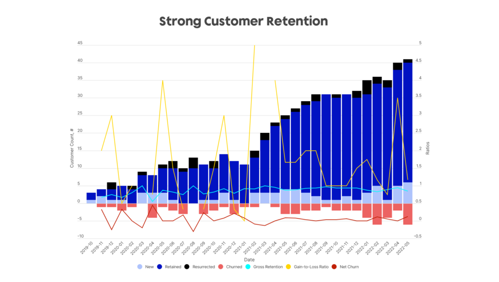
The stacked bars here indicate the breakdown of customer counts month over month. As we can see from the dark blue bars, the retained count of customers steadily increases throughout the company’s sales history especially when compared to the red bar of churned customers. This indicates that the net churn as a percentage of total customer count is decreasing. For a company whose absolute customer count is not very high (in the 40s), high customer retention is paramount. For example losing something like 10 customers would be a pivotal 25% of their customer base. The company has maintained its strong retention and limited churn over several quarters since this analysis.
Similarly, we can also look at the gross order value (GOV) growth breakdown by categories, below.
Here we also see a very strong positive trend, with slightly larger volatility due to differences in transaction amounts. For example, there may be one-time onboarding costs for new customers which may skew the growth consistency, however overall there is high gross and net retention throughout the company’s lifetime.
Another customer transaction data metric that illustrates strong retention is the cohort-wise cumulative GOV per customer shown below.
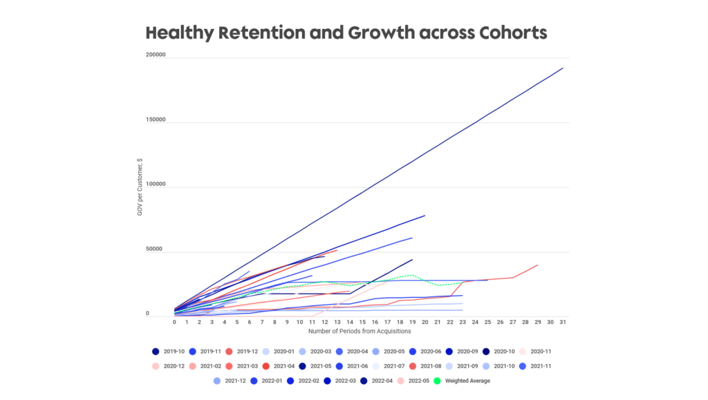
Each line in this chart reflects a different grouping of customers on the basis of their first identified transaction date with the company. This allows us to view how different cohorts of customers interact with the company over time to better understand long term product-market fit. Generally, positively increasing cohorts show long-term value and customer persistence; what you don’t want to see is that cohorts continually flatline or drop off after several months as that would indicate decreasing growth and poor customer retention. The relatively steep nature of the lines gives us confidence that lifetime value will continue to increase over time.
For this company, we see that the weighted average across all cohorts is generally increasing. In addition, there are several outperforming cohorts – the October 2019 cohort and September 2020 cohort continue to grow strongly even after the first few transaction periods. The December 2019 cohort is especially interesting as a few spikes occur, indicating not only perpetual growth but recurrent customer flow. As such, not only does this company maintain strong retention as shown in the first two customer growth charts, but also that retention is strong across different time periods and cohorts as well.
This next graph displays the Herfindahl-Hirschman Index (HHI), a measure of customer diversification.
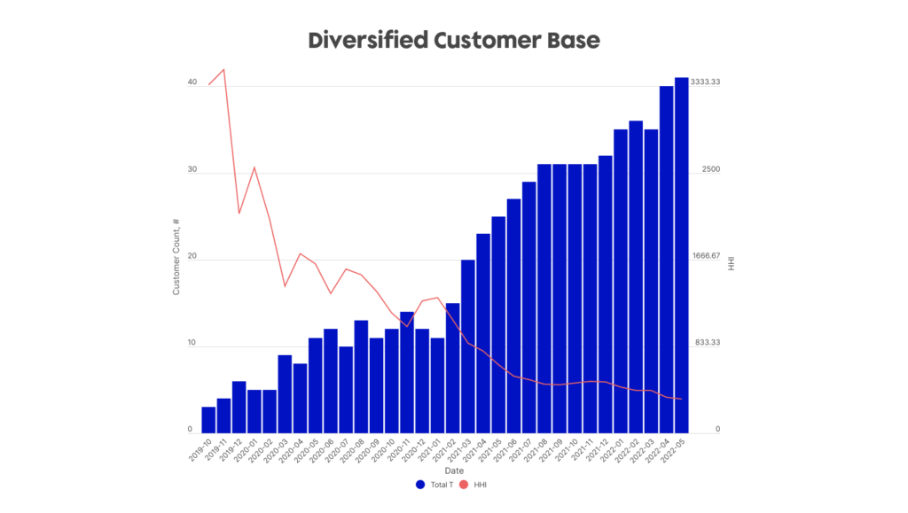
Generally, a higher HHI indicates larger concentration risk, whereas a lower HHI infers the opposite. The blue bars indicate the number of total customers, and the redline represents the HHI Index values. As we can see, as the number of customers increases for this company, the HHI index steadily declines indicating a decreasing concentration risk for the company’s GOV and greater diversification across the company’s customers. More importantly, the fact that the redline is steadily decreasing and not flatlining indicates the lack of “ghost” customers, meaning new customers that increase the customer count but have low GOV transactions. It is important to closely monitor this graph especially for a company with a lower absolute customer count.
Lastly, the final customer analytic we will review is the cohort-wise cumulative gross profit per customer.
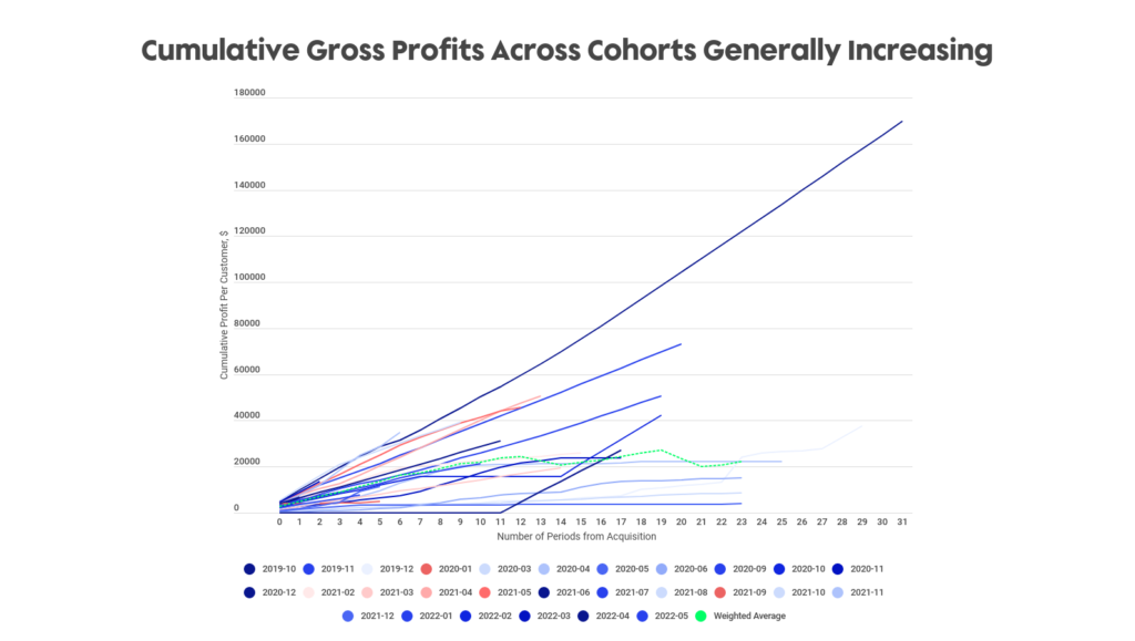
Not only is it important to determine whether a company is retaining its customers, but also critical to evaluate whether the company is profitable or not. This cohort view shows the cumulative gross profit of the company’s customers over time. We can see the steep curvatures for select cohorts as well as the weighted average cohort, indicating a stronger persistence of spend over time for those respective cohorts. Pairing this information with the company’s financial statements, we were able to determine that the company is profitable and that every new customer added is accretive, differentiating from similar companies who are generally unprofitable in their early stages.
In the current market environment where many industries and companies are seeing contractions and downturns, the company’s minimal churn and strong customer retention helped it stand out amongst its peers and showed a strong growth outlook moving forward.
Where are we now?
Another benefit of Hum’s ICM platform is the ability to keep track and monitor a company’s growth before and after funding. Funded in June 2022, several months later we’re able to rerun the analytics and evaluate any growth or change post funding.
Here we can see the updated GOV growth attribution chart as of August 2022.
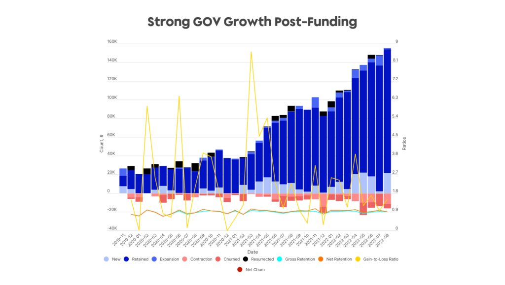
Customer retention continues to be strong while overall GOV is growing alongside a low churn rate. As we monitor performance, we see that the business continues to consistently add to its active customer base while keeping churn at a constant level. Additionally, customer cohorts continue to grow (although some more than others). Overall, any investor should feel strongly about their investment and may even consider a larger investment partnership in the future based on this positive data and growth potential. We recognize the importance of analyzing this data prior to an investment as well as on an ongoing basis to ensure the health of the company as well as potentially offering a larger financing amount.
In conclusion, these are only a subset of the analytics we’re able to calculate for any given company with their customer transaction data. Be on the lookout for the third and last part of this series where we analyze another company using their transaction data.
If you’d like to see your own transaction data analyzed, please contact our team here.